


Treat Me Kind International Rebrand

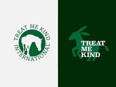
A before and after of 'Treat Me Kind Internationals' rebrand.
My client wanted to keep the bottle green illustrative elements, while bringing the rest of the identity into the 21st Century.
I used a sturdy yet friendly typeface, Superclarendon Bold, to give a feeling of 'trustworthiness' and to ground the various sub-brands of the charity. Then I drew a lot of different animal illustrations, to be locked-up with the type. The illustration adds expressiveness and movement to the otherwise solid typography.
The client wasn't sure how many sub-brands TMK were going to launch, so creating this type+illustration system was a good way to provide them with maximum flexibility when thinking about the future.
🖥Available for projects — hello@goodwit.co