SaaS Product Revision

This is a case study for an existing SaaS product. I envision the primary use as a desktop view however, since this solution is also created for smaller and/or mobile enterprise, an initial tablet view is included.
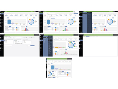
The existing solution has a number of selections in the navigation that are 3 and 4 levels deep. Since interacting takes different form factors, these mockups address spacing and placement of some of the functionality (menu, admin).
The revision(s) to the menu also allows for wider viewing by collapsing the initial navigation to a smaller bar on the left.
In retrospect, approaching this from the standpoint of "gamifying" the interface, each menu set/subset could simply be displayed as icons on secondary screens.
The other possibility would be to create some transparency and/or blur in the menu background so the user feels less disconnected from the content in the body while navigating the menu.