ARGO - A marketing & PR firm

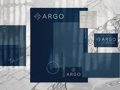
My client was wanting a logo system that elevated her as an industry leader in solving complex problems in various avenues. I wanted to create something that was strong and refined for her and to help her stand out in the marketplace.
I choose a navy/slate color paired with light gray and a lighter blue accent. I thought that this was a strong color that separated this brand from her personal brand and would stand out a bit more in the marketplace.
I also wanted to be able to visually represent that the client is great at solving complex problems which lead me to the imagery of a maze/labyrinth.