Gmail Mobile App Redesign - Primary Inbox

This design was created from the prompt from Briefbox.me (https://briefbox.me/briefs/re-design-gmail-ui-layout/)
The current design for gmail is very efficient, but also has a lot of information and possibilities for what you can do.
My design is an attempt to address several identified pain points: clarity of language, clarity of action, and clarity of how things are organized.
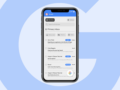
This shot is a look at what one screen of the mobile version of the app would look like. Many of the elements from my desktop version remain the same, but some adjustments were made to accomodate a mobile experience:
• A blue band with the logo at the top was added to incorporate google's branding and make it clear to the user which application they were in, since the UI is otherwise relatively sanitized of other branding elements other than typography
• Buttons and labels have been enlarged and spaced differently so that they are friendly to finger presses.
• The design incorporates the same interactions between desktop and mobile for seamless experience (don't need to learn new gestures in order to use)
• Email sender icons have been removed for simplicity. At this scale, it doesn't feel like they provide value and only clutter the remaining information.