Rebranding v10836139
And the journey continues.
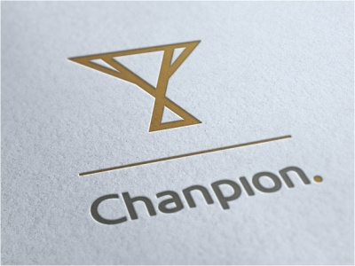
This is another version which is pretty close to what I'm achieving. A more simplified cup with the simplified name. The dot on the 'i' has been relocated to the front and in gold. A subtle reference on my design's 'winning' formula. Name and mark are designed to hold its own when used separately.
Posted on
Sep 14, 2012
More by Norman Chan View profile
Like


