Book Reviews Website Interactions

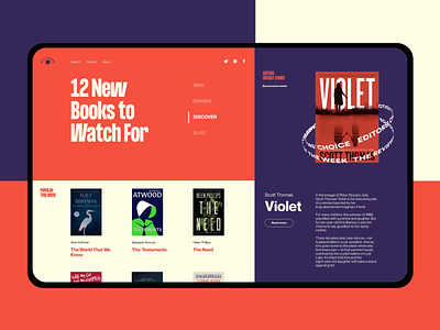
Another glance at a project that is a piece of pleasure and fun for bookworms: that’s the web interface designed for a book review resource. The page is based on color contrast visually separating different content zones and typography ensuring good level of readability and book covers presentation. Smooth animation makes the layout eye-catching and lively, also drawing visitor's attention to particular zones.
Catch the vibe and review our set of design tips on improving web scannability with a great bunch of examples. Or explore the case study in Tubik Blog on UI and UX design for a vehicle safety app.