rude roots brand logo


rude roots is a brand that delivers fresh and coldpressed juices with the best ingredients. The first products are gingershots so this is only the first insight into the project.
We decided to create a general brand, that gives us the opportunity to expand the product range sometime. We wanted the brand to be perceived as super honest that’s why we chose “rude roots”. The shots won’t taste like cotton candy, they won’t please everyone, but they are effective with best ingredients and zero bullshit.
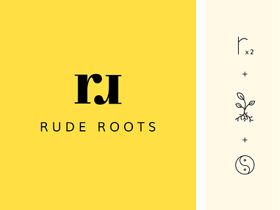
The symbol is a combination of the two R’s, a root and the yin & yang symbol as a hint to the origin of ginger and a well-balanced life.
Would love to read your thoughts, feedback always welcome!