Landing Page AB Test


When designing the landing page for Allium, it was important to test different layouts of the product flow to see how it would affect lead generation.
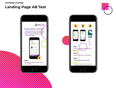
The left option enlarges each step, allowing the user to user to clearly see the whole flow, but also involves more scrolling to see the entire product flow.
The right option allows the user to see the entire flow on their screen at once, but the content is much smaller making it harder to see.
Both are viable options, ultimately our users will decide which option wins out.
Credits
In collaboration with Philip Sams https://dribbble.com/PhilipSams
Not designed by UX Design Cravings: Allium logo