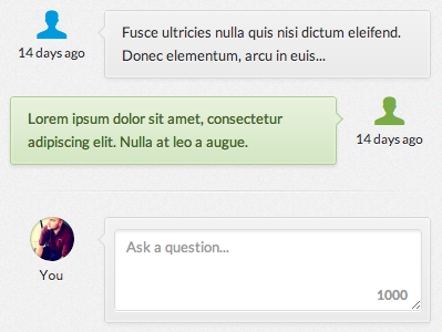
Simple Conversation (v2)

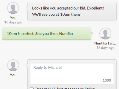
Decided to ditch the icons and go with a consistent avatar look (with default, using helveticons). We'll be using gravatar so it can't use a web font default without a bit of thought (which wouldn't be worth the time). It's going against the grain of iOS coloring and layout but I think it needs to be more obvious what's been sent to you. If viewed by the "other side" of the conversation, the colors and layout are flipped.