


LexCorp Logo

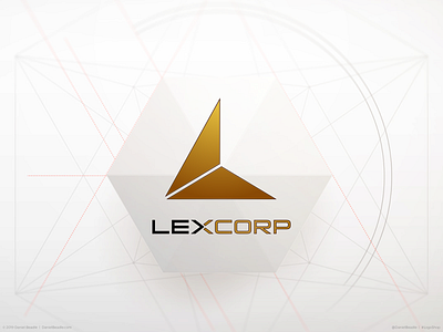
The LexCorp logo, as seen in Batman vs. Superman and its tie-in materials, had the perfect tone for the company it represented. It’s cold, sleek, and cutting edge. One major problem though. Lex Luthor’s brand has everything to do with the letter “L," not the letter "X."
To fix this oversight, I started with the triangle, a shape that signifies ascension and achievement, as well as an association with secret power. Turning the triangle into the letter “L” was a relatively simple task, splitting the shape into thirds and removing the top right portion. I then went to work on the typeface, turning the left half of the “X” into an arrow, pointing to the second half of the name. This subtly suggests forward motion, since the company builds the technology of tomorrow.
In the end, we have a corporate brand identity that is simultaneously classy and intimidating, drawing on the history and iconography of the character at its center.
Read the full article:
https://medium.com/@DanielBeadle/logoshop-part-4-lexcorp-c5b9c08a8afb
Download the wallpaper pack:
https://gum.co/lexcorpwallpapers