Rina Jensen: Business Resiliency Coach Logo

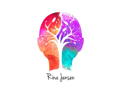
Rina Jensen had reached out to me to create a logo with her. We sat down and talked about what she wanted. She talked about her tattoo and wanted to somehow incorporate that into the new logo.
After chatting a bit, I figured out she wanted to show how the brain works in her logo. Once I did some research, I found that some colors are associated with each side of the brain. That represents the watercolor parts on both sides. The tree represents growth and is a big part of who she is.
This was a very very fun make. I'm also building her website so stay tuned for that as well :)