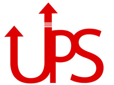
UPS REBRAND
Mock up coming soon!
Proces behind this was making a more modern and minimalist design for UPS Delivery services. One main goals of the company that fed into this design was the aspect of financial growth and stability. This ethos has been incorporated into the design with the arrow tips, symbolizing the upwards trending of stock. Furthermore, the dashes on the longest arrow stretch portray the dynamic growth of the company.
concept
design
designer
graphic
illustrations
illustrator
logo
mockup
packaging
project
red
templates
View all tags
Posted on
Aug 12, 2019
More by Chillee Noir View profile
Like

