Borjomi

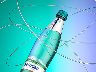
The new design of Borjomi mineral water embodies the brand’s bold nature. The bottle has adopted a new style without losing its familiar image. Its well-known packaging now comes in a new look, with updated label designs and a change of color for the cap. The Borjomi logo has also been redesigned in a more expressive and up-to-date style. The general look will be more streamlined.