


Rebase Logo Update

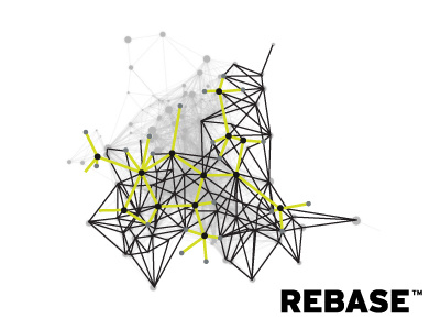

Now we have the idea agreed, and the client has expressed mad enthusiasm for the direction, I can proceed with the redrawing of the rather complex network/node structure.
Watch this one evolve. Looks fugly right now, but hoping it will look awesome when completed.
What you see here is my progress on redrawing the logomark only. The Rebase wording is there provided as just as a label. See previous shot for proposed logo layout.
This bunch of nodes will ultimately form 2 distinct parts. The Lime Green network represent Rebase and as such will be a simple and well defined pattern that will overlay the daunting and complex structure underneath. It will no doubt be clearer than it is now, with the black lines probably being heavily faded.
The concept is that Rebase is a means to create a simple structure, the backbone/DNA, in the complex world of data.
Complicated isn't the same as complexity. So although it it may look complicated, Rebase provides 'order' to the underlying complexity of data.
Pardon?