Lalik | Beauty and Health Clinic

Lalik satisfies diverse demands that go from the simplest facial cleansings, to specialized treatments to eliminate the acne and the stains, to correct lines of expression, liftings, peelings, exfoliations, treatments anti cellulitis and stretch marks, among other specialties.
The re-branding project was built under three basic fundamentals: Wellness, Harmony and Beauty, reflecting a relaxing atmosphere and personal care that defines Lalik at it’s purest essence.
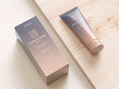
I was able to create a visual identity that could easily translate into graphic assets, and mainly, to elaborate a solid packaging line for their locally made products.
The visual identity relies on solid pastel colors and gradient combinations. The use of two completely different typefaces: a serif to suggest elegance and sobriety, and on the other hand a quirky handwritten typeface to mimic a personal touch.