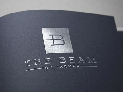
The Beam Silver on Farmer logo
I was involved in the branding process at a very early stage, working with Narwhal Stories, RSP Architects and Mortenson Construction on the naming of an upcoming commercial real estate development. The building sits on Farmer Avenue in Tempe, walking distance from the historic Mill Avenue. We considered multiple aspects of the development, including its proximity to a rail line, as well as a wood theme, being in the neighborhood of Maple, Ash and Farmer. The building itself is an unusual design for Arizona, being constructed out of cross laminated-timber, a wood product that combines layers of natural timber together in order to create a defined and eco-friendly experience. In the end, the wood factor and the architectural style were the biggest influences on the name. “The Beam” has the connotations of raw wood construction, but also the optimism of a beam of light.
The raw wood aspect of the design evokes something akin to the Pacific Northwest more than Arizona. The name “The Beam” also suggested something with a strong horizontal layout, to evoke the beams of the wide open interiors. I chose a slab style font because it feels like a strong foundation, and also references “slab construction.” The end result could just as easily be a hip Portland coffee shop, but it would be unique in its Tempe, AZ neighborhood.
We developed a secondary logo with a monogrammed B to be used in places where the logo application demanded more of a square layout, like most social media platforms.
During color explorations, we determined that it wasn’t important to have a signature color, so it would remain a simple black and white. What was important was to consider how the logo would be applied to the physical space once construction was done. It could be etched into raw wood or stone, or applied to glass.

