Tulip Logo Concepts

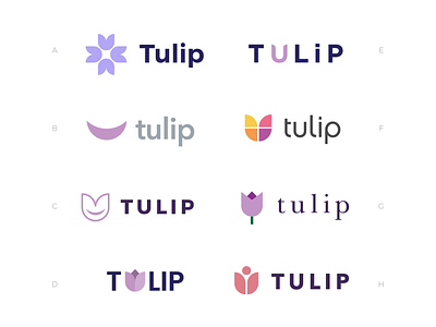

Logo concept exploration for Tulip. For B and C, the smile/moon shape is the shape of a sickle cell.
Tulip is an online community where sufferers of sickle cell disease can learn, network and thrive by taking back control of their health and lives, for a sustainable wellbeing.
TULIP stands for The UnSickled Life Practice and this name embodies the idea that living a life where you’re not constantly having sickle cell crises takes determination, directed effort and consistent practice. The tulip flower is a symbol of dignity and represents the dignity inherent in taking control and not leaving your life and fate in the hands of ‘experts’. The overall message is one of hope, aid and community.