


Familine

Familine is health clinics for families offered a comprehensive approach. Our goal was to make a rebranding completely changed the existing design concept.
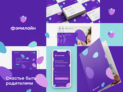
We developed the minimalistic sign inspired by the European style of the clinic. Metaphors of care, sprout and ripe flower represent new life. Violet, pale pink and light blue colours are set the clinic out of competitors. We also proposed soft but confident font to logotype.
An egg as an element of the logotype represents a new life and is used as a pattern to combine all elements together.
________________
Let’s connect:
We are open for new projects → work@voronoi.co