


Financial


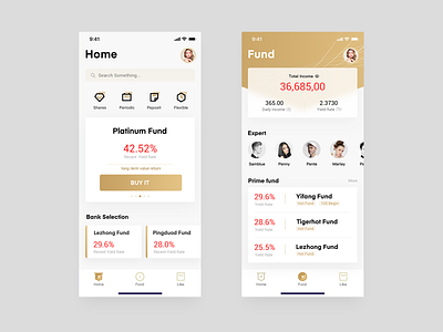


Financial products to convey users a sense of security and trust, so abandon the red to choose gold, shape is also more use of some strong orthogonal. I take the "my" module out of the tabbar and put it on the right, because it can reduce the user's choice of icon on the tabbar, make the user have a clearer grooming of the product's module, and highlight the user's module, because in financial products, users often look at their accounts. In these two pages, I want to design differently for different user groups. The home page is for senior investors, who understand the market, so it is important to reduce the operation and go directly to the module he wants. The second one is for novice investors. It's important for them to understand all kinds of information at a glance. Therefore, it also adds a section of financial experts to help users.