


Netwise - CRM Solution Company | Subpages


🏀 Hi Dribbblers!
The goal was to create a cheeky, but strong brand image that stands out among the competition in the industry.
Netwise wished just to refresh the logo without changing it, so we decided for strong, aggressive colors and add-ons to enrich the illustrations.
The main idea was to create an outstanding communication style. After a long analysis of the industry and websites of the competition, we have found that these are usually not very bold - rather simple and ordinary.
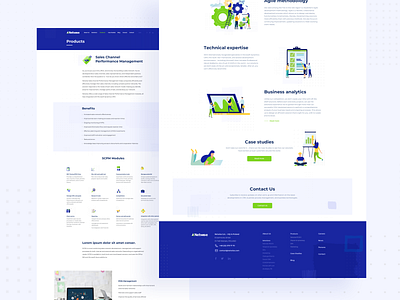
The client did not want the brand to look tender or immature. He rather expected us to create a strong and courageous image of the company. That is why our concept was to use shapes that do not have rounded edges - therefore the idea of using squares and other square-shaped forms was born. Various designs closed in squares were meant to give the brand a particular, individual touch.
______________
Press "L" or "F" if you like it ❤️
We're available for your projects: design@osomstudio.com
If you want to see more works check our website and behance