Tea Time Magazine Redesign

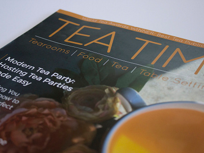
TeaTime is a magazine for all who love tea and who want to enrich life with the serenity of teatime. This magazine gives off a English Breakfast tea vibe than it does a green tea vibe. I wanted to broaden the audience of this magazine by merging the young and old tea trends together. I gave the text a minimalist style while keeping the photos vibrant and fun to keep the reader engaged while not overwhelming them with a heavy font since there is a lot of text. TeaTime has includes many recipes to try with your tea so to add a special feature to the magazine, I added a fold out page with two featured recipes that could easily be torn out. This magazine definitely strengthened my photography skills. It was challenging but fun project.
2016