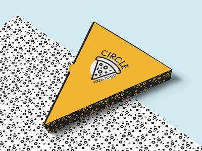
Branding for pizzeria
CIRCLE PIZZA
🍕
About company
Production and sale of pizza in the format to go. This is exactly the pizza, which is always easy to take along the way to eat, it is nice to bring home and to please relatives or friends with delicious food. Modern format, tasty, fast and convenient.
Call
The design should carry a positive mood, pleasant associations. Show that we have a delicious pizza and not expensive at the same time. And most importantly style and quality.
Decision
The main colors in the development of branding steel: rich yellow, charcoal black and additionally white. Yellow color always carries a positive mood. And in contrast with the dark it becomes even brighter and richer. The logo has become a slice of pizza, on the background of which a circle - it personifies the name and shows a constant movement, infinity and this orientation to the center, invisible, but real. We also developed two patterns: one in the form of a pizza filling (slices of tomato, spices, meat products); the second is a breakdown of the logo: a circle, a slogan "PIZZA TO GO" and pizza triangles.
Russia, Moscow
See more:
https://www.behance.net/gallery/75500367/Branding-for-pizza-CIRCLE


