Compliance

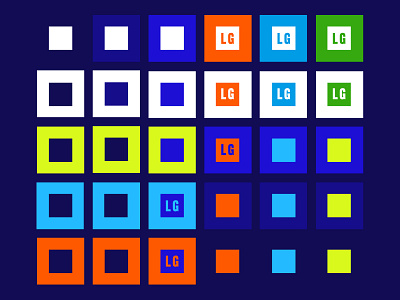
When you make a chart/guide for the color contrast on a website your designing 😅
Definitely, love this palette but it's crazy to see how it changes when contrast ratios come into play (everything marked with an LG only passes large text usage and graphics 🙃)
What have I learned? It's hard for people to see bright/vivid colro on white BUT not darker colors! 👀