Gap Logo

Detailed write-up on this GAP logo idea on my blog : My Interpretation of the Helvetica Gap Logo Design
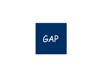
Tried to resist doing a 'sensible' option, but failed. Nothing extraordinary, but felt it made sense to stick with a style of Helvetica given all their advertising materials has focused on Helvetica for some time.
The problem they have using helvetica is that it's hard to really make it 'ownable', hence the need to add this dated blue graduated box just to draw some distinction. But it doesnt work. Type works better on its own, but is hard to really 'own'. Whereas the original is 'ownable' in every sense of the words. They will find it hard to match that level of individuality with a Helvetica logotype.
Certainly not 'putting' this forward as a serious alternative, it's just what I would do to improve the 'new' concept. In my eyes, they should revert back to the original, or at the very least, just freshen it up a little. There is nothing wrong with it, regardless of how long it has been around. Any company should feel proud to have a mark like they had, it's timeless, which is what all strive to create, it's stylish, its memorable and compact. I love it.
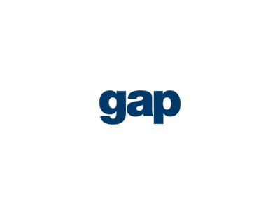
But anyway, my improvements to the 'new' Helvetica idea are this.
Helvetica can look sweet but it can also look bad, which I think the new logo shows. A few tweaks, a different style more suited to the letters, changing the colour and you loose the cold clinical feel that the new one currently gives.
Lowercase G softens it up, makes it more friendly, more approachable. Just don't think the uppercase G works in this combination of letters. It overpowers the 'a' and 'p'. Lowercase feels much more compact and natural. Black can be pretty harsh, especially when used next to a blue, takes on a sterile, clinical conservative feel. So changing the wording to blue sorts out this little problem and now no need for a blue box now as the lettering carries this 'previous brand association' just fine.
Weighted it up to Helvetica Neue Black and closed up the spacing.
The graduated blue box add's nothing whatsoever of value, other than an eyesore, but does prevent it becoming an elegant and clutter free solution.
Unlike the 'new' one, this lowercase option will sit anywhere, can be reversed white on blue etc. Can be used 'in context' with their other Helvetica marketing collateral, sat in situ, without looking out of place.
Or it can be used alone, in an number of reversed out coloured backgrounds.
The overall design needn't be rocket science, it's just the reasoning and rationale behind it and the execution.
Meh.