


Brand new home page


THE PROBLEM
Remessa Online's website was outdated, with little visual appeal and content that tried to convey too much information at once. Also, not much had been done to distinguish Remessa Online from competitors like Transferwise or Western Union.
THE SOLUTION
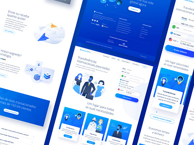
We adopted a simpler approach to the site's content. Instead of flooding users with information about the product, we focused on communicating its value propositions with clarity and concision.
In regards to visuals, we chose a cleaner, more modern look in order to make communication more immediate. Also, we tried to promote emotional appeal with custom illustrations.
___
Wanna chat with us? We're hiring!
UX/Researcher
UI Designer
UX Writer
Digital Art Director