Otis College - Annual Exhibition Redesign

Live site - https://www.otis.edu/annual-exhibition
Annual Exhibition is an end-of-year student exhibition that showcases the works of graduating seniors to the Otis community, friends, family and perhaps most importantly, prospective employers.
The Annual Exhibition website is an important tool for helping connect employers with rising talent, so I was given the task of rethinking the existing structure, both inside and out. One behind the scenes improvement I made was making adding portfolios to the site much easier. What used to take a team of 9 weeks to process was completed by a single person in a fraction of the time. Yay Photoshop actions and improved system design!
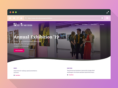
I really challenged myself with the shape layers to create something that wasn't a typical "boxy" design. It ended up being easier than I thought to translate to front-end code, though the second shape layer underneath the videos ended up being surprisingly difficult to handle. In the end, though, I'm proud of being able to get the great video my teammate produced sliced into the banners.
A few UX tidbits: most of the pain points our users reported with the old site had to do with the small size of the portfolio thumbnails and obtuse navigation system. To address the thumbnail, I not only increase the size substantially, but also created a slider that adjusts the grid size and thus, portfolio thumbnails to the user's preference. Lastly, the navigation system was thoroughly simplified by converting the whole site into a single page, as opposed to about a dozen.
If I had more time, I would have further refined the visual look, made some more micro-interaction states and probably implemented a fixed menu navigation pane. But for work that was almost entirely done by me in a month or so period, I'm happy with what I accomplished.