Art of T - 2

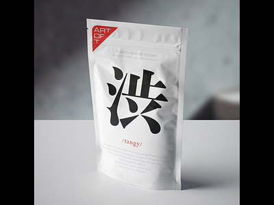
The logotype and the packaging for teas. The concept behind them is to describe different tea mixes using English language adjectives starting with the letter T. The illustration is a character from Chinese language which essentially means the same as the adjective. Thanks to the abundance of synonyms from the English language this has been a surprisingly easy task to fulfill.