NK/FC NAŠK Našice (Croatia) new logo and branding

I'm very pleased to show off my latest cooperation with FC NAŠK Našice, with a completely redesigned logo, branding and merchandise. It was a very exciting process and I'm very happy with the result!
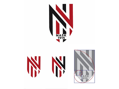
Marking 100 years of the club's existence, they decided to refresh their brand and make it more modern. The general shape still mimics a coat of arms, giving the logo a dash of tradition. The number of vertical stripes is now reduced to only four that intertwine and create two letters N. At the bottom of the logo, the club's acronym and founding year is added.
Sa zadovoljstvom se hvalim s najnovijom suradnjom s NK NAŠK Našice i u potpunosti redizajniranim logotipom, brandingom i reklamnom robom. Cijeli proces je bio vrlo uzbudljiv i vrlo sam sretan s rezultatom! 😀 Obilježavajući stogodišnjicu postojanja kluba, odlučili su osvježiti svoj brand i učiniti ga modernijim. Općeniti oblik loga i dalje oponaša oblik grba/štita, sto mu daje dašak tradicije. Broj okomitih linija sada je sveden na samo četiri koje se međusobno isprepliću i tvore dva slova N. Pri dnu loga dodan je akronim kluba i godina osnutka.