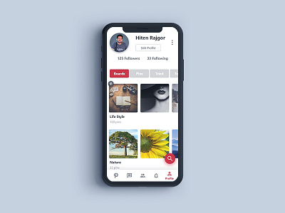
User Profile - Pinterest - #dailyui - 006
Here is the dailyui challenge - 006
.
The concept was to create a user profile page.
I had re-design Pinterest user page.
.
The objective was to make it more user-friendly and clean.
Problems noticed & Fixes:
The current version had used the user name in big fonts and profile picture on the right, which is kind of opposite as compare to other/generic apps.
Fix: Hence had reduced the font size and moved profile picture in the generic position.
.
Option to edit profile is inside settings, and settings have other options as well which might not be used by the user as frequently as editing profile.
Fix: Had brought edit option out, in front and had added 3 dots in right to indicate settings and other not so important options, like Pinterest is using in their desktop site
.
Search was on the top left, which is I believe the most used thing in the app and with the upgrades, in phone models, it's difficult to reach out on the top left
Fix: Had changed search bar as FAB which will be available on all screens for easy to reach and search.
.
Tab to switch between pins to boards was having flat shades of gray
Fix: had added Pinterest's red color to bring in user interest
.
Recently saved, top 4 pins were shown in each board, if the user wants to see other then the recent 4 pins, the user has to enter in the board.
Fix: A slider-type treatment is used, so a user can simply swipe and expand a particular pin.
.
Options like messaging were on top next to search bar
Fix: It's added in the bottom navigation for easy to reach and quick switching from other screens.
.
.
Let me know what you feel


