Beachin' Hot Dogs
If you thought maybe these hotdogs are bitchin' you'd be correct.
Umbrellas. Salty sea. Beach rollercoaster. Surfin' USA. Beachin's aesthetic piles on the nostalgia while still anchored in the present day.
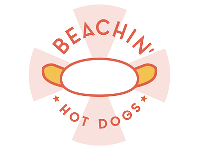
Nostalgia is introduced by the color palette which is inspired by 1950s and '60s posters advertising beach destinations, and pier amusement parks.
The background pattern reinforces the nostalgia. It's simultaneously reminiscent of a beach ball, umbrella, and stripes from a pier rollercoaster.
The typeface used is sleek, simple and modern which helps keep this logo current.
The colorful personality of beach culture is seen in the text. "Beachin'" is a play on words of surfer lingo. It's both "beaching" (being at the beach), and "bitchin'" (super rad, dude.)
The hotdog illustration quickly communicates Beachin's bitchin' hotdogs. The simplicity keeps the look clean, and modern.
Each element culminates into a logo that conjures memories of playful days at the beach combined with a true summer staple -- delicious hot dogs.


