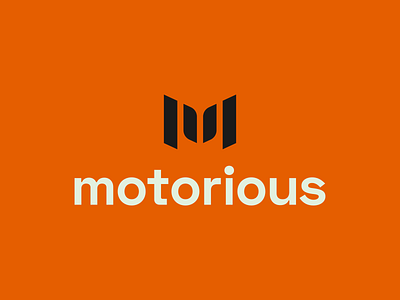
Motorious process

Here are a few marks I worked on for, what is now, Motorious.
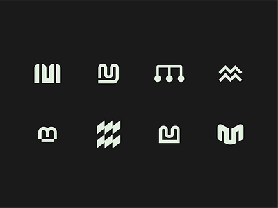
The initial name of the company was Motorbase, so some of the designs are a play on the letter's "M" and "B" while others just use the single letter "M."
For the ones where I was only using the letter "M," the idea was to somehow incorporate a graphic that related to the automotive industry.
What was difficult about this was whatever graphic I chose had to be something all hobby segments had in common. As I was searching for inspiration, I found similarities between the shape of the "M," and a tire tread. At that point, I felt that I had a solid direction to build off of.