Gatorade Rebrand / Icon Options

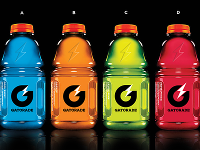

What Icon do you like best? A, B, C or D?
I spent the morning working through this passion project of mine. I took the feedback I received yesterday from instagram, dribbble and twitter and pulled out a few learnings:
1. The negative space looks kind of like pacman. I honestly don't see this as an issue however I figured I'd check to see if there was and easy solve
2. Some people suggested a larger bolt to balance the size relationship of the G and the bolt
3. Some of you suggested adding some space between the bolt and the G.
If you were the CMO of Gatorade, which option would you pick?