Crossfit logo

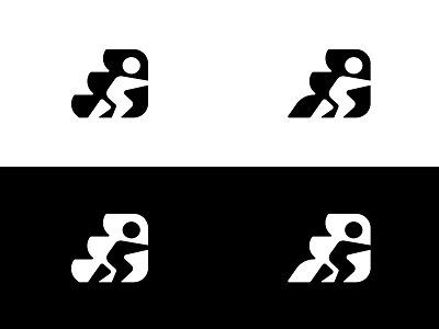
Still finessing the previous logo.
I made the cuts on the left more open and curvier to lessen the 'dinosaur' vibe it had.
Left or right? what do you guys think?
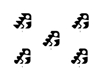
Still finessing the previous logo.
I made the cuts on the left more open and curvier to lessen the 'dinosaur' vibe it had.
Left or right? what do you guys think?