Mcdonalds Redesign
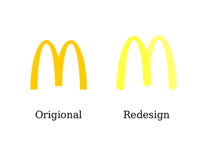
Here is a redesign of the McDonald's logo next to the real one. I wanted to change the mustard yellow to a brighter color and create a slight contrast between the two sides of the M, making the first part appear closer.
designer for hire
fast food
invite me
logo design
logo inspiration
logo redesign
macdonalds logo
work in progress
work in progress logo
View all tags
Posted on
Feb 21, 2019
More by Natasha Gray View profile
Like

