League Typeface Family

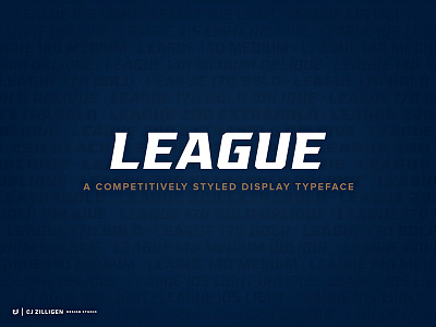


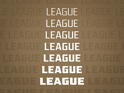
Over the past 3 months, I worked on rebuilding the "League" typeface in a way that provided more flexibility and personality. Each character was rebuilt and re-kerned, along with some new additions. Light and heavy extremes were added with 4 weights in between, and the italic angle has been pushed further to make the typeface more impactful as a headline.
I also included 3 separate weight packages available for purchase. Check it out on CreativeMarket.
Enjoy!