UQCS - Rejected Logo Concepts

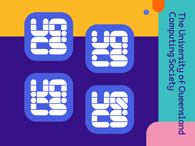
This is a rejected logo concept for the University Of Queensland Computing Society (UQCS), a student-run society for all things tech. This was my submission for their recent logo competition, and while it ultimately didn't reach the top three, I had a blast designing it and figured I'd share it here.
This is one of my first ever custom typefaces and while the Q was especially tricky to design out, I'm quite happy with the results here. I used a purple background in the logos as tribute to the official university colours.
Which one's your favourite out of the four? And how could I improve these concepts in future? Drop me a comment below.