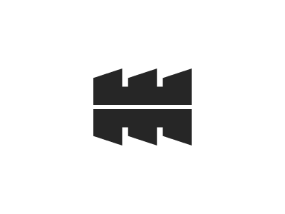
Web Machine Mark
Just a mark I am working on for my web design company Web Machine Inc. It's represented here in it's simplest form, free from distracting backgrounds, textures, gradients, or an enclosing circle. I think a logo should be as strong as possible on it's own.
I also chose not to pair it with any qualifier (company name or tagline) just yet. I know it will definitely need something, but this is where I'm at so far and that will come with time. I also don't believe the qualifying text should make or break a logo.
I was going for a sort of mechanical, industrial feel, while still keeping the tone modern. I want something that can lend itself to a number of styles and implementations and possibly lead into a mascot of sorts, or a retro stamp kind of idea; something fun to play around with.
I'd love to hear some crit if you've got the time :)

