Sensies logo S symbol and dot animation

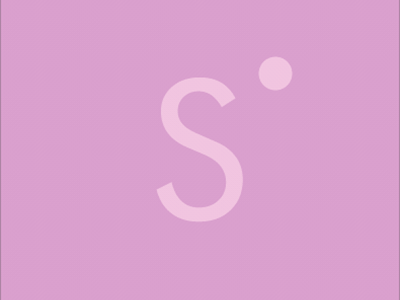
Logo created for a new project called "Sensies". The solution had to be neutral, simple and minimalistic with the symbol accent covering the sexual theme horizons. After lots of sketches, I came up with the DOT. Yes, what could be simpler than dot?? ! But it totally represents the theme as "Sensies" dives deep into sexuality from a woman's perspective and uncovers all the sensual dots of pleasure. Does the dot pulsation create tension?
.