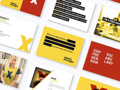
Impact Dyslexia Brand Elements
Some brand elements and applications that came out of branding work for Impact Dyslexia.
My son has dysgraphia so this brand is near and dear to me but, beyond that, they're super interesting from a branding perspective. They have two very different audiences and they want to address those audiences in very different ways and with a different tone, but with one brand and one voice.
One audience is dyslexics and their families and friends. Their brains are wired differently, with a lot of pros in terms of how they think and ID wants to support them. The X for them is a superhero mark. The t-shirt (lower left) is a throwback to the classic X-men costumes.
The other audience is the education and government institutions that are failing dyslexic kids and ID wants to be pretty in their face about making some changes. For that audience, the X represents eliminating the obstacles dyslexics face and the systemic issues that arise from that.

