Sisters of the Sierra Logo

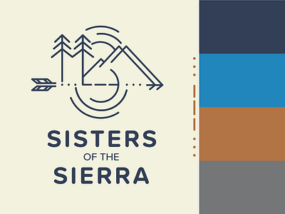
Developed a logo for a women's networking organization bridging Reno NV to Auburn CA. SOS is the abbreviation for the organization, so the morse code symbols are represented as well as the mountains and Lake Tahoe tied together with forward motion and the trees "holding hands" as a symbol of sisterhood and growth. This logo will be primarily used for swag and social media. The client wanted a tribal yet modern design, and specifically asked that the colors not be stereotypically feminine, so I chose colors that are found readily in the Lake Tahoe area.