


Visualization Dashboard UI Kit

Hello Folks...!!!
I'm very excited to share this with you.
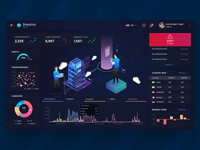
The thought process behind this process is Server Management. Usually, in servers each graphical representation will not be much appreciated, clean and clear and also all graphs will be viewed in various parts/links.
The thought I used here is to simplify the process of the Management with a single simplified dashboard of overall usage, analytics, etc. On tapping the analytics or usage, it can be viewed elaborately.
When some issue happens at any part of the server like data over usage or someother tickets, queries, etc. It will be notified on the screen with a red popup and until it is cleared it would be settled down at alerts box on the right top corner.
Using the same old white background with usual graphs may seem to be boring to many admins. So I made the Background in black, which can reduce the usage of monitor's power by 20-40% with the graphical representations in gif mode. So any beginner user/admin can understand perfect using my dashboard on what's going on through it.
I hope you will like it :)
As always, your feedback is much appreciated. ✊
Thanks for watching! :)