


11/50 Daily Logo Challenge | Daily Logo Challenge Logo

Day 11 of the Daily Logo Challenge. So much for nobody noticing me missing a day as I follow up by being 4 days late on todays design... oops. Here's to getting back on the horse and making the time here on in and acing this challenge.
Prompt: Daily Logo Challenge
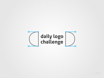
The challenge for 'today' was to create/update the logo for the design challenge itself. In the end I decided the best idea was to work using the official logo as a starting point. I have chosen a slightly more rounded font and dropped the capital letters to make the logo appear more friendly. I have also added a symmetrical 'bookends' to the type using the imagery of most vector software as inspiration. The cool electric blue is very modern and inviting, much more so than the red's used in the current branding.
Fingers crossed, hopefully see you tomorrow for challenge no.12!
All comments or questions welcome,
roast my design below.