Facebook - Desktop Landing Page

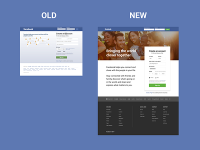
A quick unsolicited aesthetic touch up to the Facebook desktop landing page using Figma.
I decided to not change much of the page structurally since Facebook hasn't updated the page in years which may mean/suggests that:
1. The current page works (is effective and converts)
2. It's not a business priority for them to change
3. Other reason?
In any case, thought this would be a fun exercise. Some thoughts on the touch up:
1. Used a hero image to evoke emotion and convey their mission.
2. Modified typography to emphasize the product value proposition. Borrowed copywriting used across other marketing pages for brand language consistency.
3. I personally wanted to add some organization and hierarchy to the footer links. Used a darker background for the footer to distinguish the element from the rest of the page and could potentially look appropriate across other marketing pages of the site.
4. While redesigning the page, I noticed that the page was not built responsively, so if the user resizes their browser, the page doesn't adapt leading to a not so optimal user experience. A suggestion would be to apply media queries and design for smaller breakpoints (e.g. at 768px width) as well. (Though this wouldn't be a concern when on a mobile device when a user is directed to the m.facebook.com version of the landing page instead.)
Final word: Would be curious to understand or see if they utilize A/B testing if they were to set out on redesigning or optimizing their desktop landing page.
Any feedback would be much appreciated! ...and curious to see how others would redesign it!