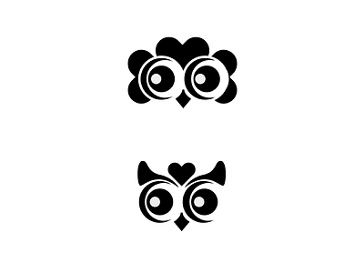
Hooters Rebrand Concepts
Trying to come up with owl + chicken hybrids for a rebrand of Hooters! The current logo is more of an illustration than a logomark in my opinion, which is why I want to make it simpler. Something that works in black and white may be the answer.
Inverting the colors make for an interesting change in mood, perhaps because of how white shapes seemingly occupy more space. Click on the attachment to see them amidst a black background.
art
black and white
branding
chicken
concept
design
flat
flat design
identity
illustrator
logo
logo design
logos
mark
owl
restaurant
simple
simplicity
simplification
View all tags
Posted on
Dec 26, 2018
More by Newton Llorente View profile
Like


