SwissTap Logo

A logo design idea for a social media agency.
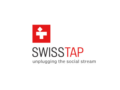
A cheeky nod to the Swiss cross. The lower portion of the cross conveniently forms a 'T', where the top angled portion reflects the openness in free flowing and unobstructed communications. Or alternatively, a person, head angled back 'talking'. And at a great push, a front view of a tap, yes I know... it's a push. :)
I reference this 'person' in the tag line 'social stream', as people are a 'given' in social media.
I also devised the tag line for this logo. The tag line references the effects of opening up the 'tap', releasing the contents out into an unplugged and unrestricted social stream.
Typography
Interstate Bold used for main wording with Poynter Agate regular used for the tag line.