


TAIC collateral

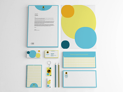
More from the identity system I worked on for the Tulsa Area Immunization Coalition. The pattern is built from the counter of the O in Avenir, which is the brand font for TAIC. The shape is also used to contain the penguin icon within the logo. The shape is a representation of the colored marks on Emperor Penguins. The use of the shape, and the story behind it, help tie everything together and create a harmonious repetition throughout TAIC's materials.
Full case study at www.russellwadlin.com
