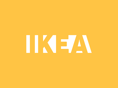
IKEA logo concept - V2
I wasn't quite happy with the first batch of IKEA concept logos, so I came up with this final version that uses negative space, but is still easy to read. This could also be used with a blue/yellow or blue/white color scheme.
Please let me know what you think about it!
Posted on
Nov 14, 2018
More by Ben Johns View profile
Like


