The Night's Watch finally gets a website
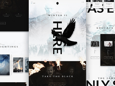

I know, I know… I am not winning most original idea. I figured after last year’s design went a little off the rails, I should just embrace the fact that deep down, I really want to do a Game of Thrones themed design. And let’s face it, we all missed the show this year.
The primary goal, aside from giving the Night’s Watch a web presence, was to impart a sense of losing ground, so as you progress down the page you’ll notice that the black sections become increasingly surrounded by more and more of the white, while the fires are smaller, and the images are increasingly more desperate. The design ends with a quote from Melisandre, which can be interpreted as you see fit.
I’ve always been fascinated with black and white as a color scheme, and I loved exploring those (non-)colors within the themes of life/death, and fire/ice. I was going to mention the challenge of getting the screen captures to all look uniform, but why bother after @Westley Aaron’s entry. Dude set the bar stupid high for photo editing. So…mine has some text in High Valyrian?
Thanks again to @Elegant Seagulls for hosting this contest! Oh, and special shout-out to @Ryan LaBar, because two years ago you mentioned not being included in the design when I used other members of your team, I’ve got you covered this time around.