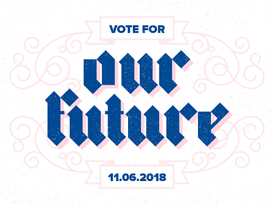
Vote! (rework)

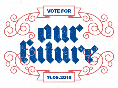
When I originally created this, I felt like the red and blue were too much together. So I tried toning down both colors and took the red dropshadow away, and am feeling like it's better balanced. Hooray for coming back and revisiting work with fresh eyes!