Kansas City Chiefs Concept

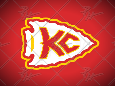
An updated look for the Chiefs' Arrowhead and monogram. I really wanted to eliminate the black and focus on the red, yellow, and white while making a monogram that looks like it belongs in the arrowhead and isn't just slapped on it. I understand that it would not work in the reverse, however they could use the shape and player's number in the shape or have the logo on one side only like Pittsburgh.